


Solutions is not the solution
A plate of spaghetti that the waiter dropped on the floor? No.... Maybe the cat got into Grandma's yarn? No... Maybe a copy of Enron's profit and loss statement to the FTC?
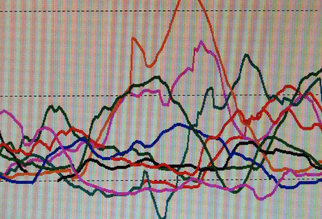
No, this travesty is eleven days of real-time BG data presented in "Modal Day" on the Guardian Solutions Software. The more I work with this software, the more I hate it. Solutions just frustrates the shit outta me. It comes so close to being fabulous software, but it falls short on every front.
Was it just thrown together in a rush to market? Possibly, but Diabetes Software from all the companies is very lacking (with the exception of the temporarily-off-the-market Co-pilot from Abbot).
Solutions suffers an acute case of in-flexibility. You simply can’t set the parameters. Take modal day, for instance. This is a great function to have, and I’ll talk more about that in a little bit, but Solutions does not let you set the number of days it displays. It will display every day you’ve downloaded. Up to 21 days! Twenty-one days is too much to pile on to one graph. I’d like to be able to do a week. Or maybe two weeks, but week-days only. Or maybe four weeks, with weekends only. Can’t do it with Solutions.
The idea behind modal day is to display multiple days over the same time values. This has a great benefit to adjusting therapy, especially basal rates. If we saw that my numbers tended to drift too low at 2 am most of the time, we might correctly assume I was getting too much basal insulin around midnight.

But let’s back up a moment so I can give you the basics of the software. Medtronic includes a computer dock with the system. I made fun of it a week or so ago, saying it looked like something AT&T would have made in the ‘70s. Maybe that was unfair, and now that I’m using it, I really like it. To download data from my Cozmo I have to use one of those free-standing infra-red readers. It’s a pain the ass to get the pump and the reader lined up right. The Guardian dock, by comparison, has a cut out the shape of the monitor. Take it out of its case, slip off the belt clip, and plop it into the dock. Nothing could be easier.

I should mention for those of you who run out a buy a Guardian tomorrow, if you have trouble getting your monitor to download you MUST enter a patient ID number in the window under “last name.” It can be any number.
Any way, once the data is downloaded to your PC you have basically three options for viewing it. The first is a classic log book. Yeah. Right. A log book where you have given your self a finger stick every five minutes for 24 hours. What is that, 288 entries? It also includes alarms, and if you’ve used the feature, your carbs, insulin, exercise, and notes. (I apologize for springing that on you out of order, I’ve got a post half-written on those features, it’ll be posted in a day or thee.)
If it wasn’t for a weakness elsewhere in the software, the log book would be useless. The next option is called “Sensor Details.” I would have called it “Calendar,” and it will make all of you drool. In seven square little boxes it displays a line graph of your BG for 24 hours.
Your first thought will be: Wow. How cool is that?
Your second thought will be: Ohmigod, I thought my BG was in better control than that!
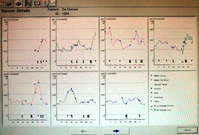
You’ll notice that most of the day is missing on the first day. That was the afternoon of my first hook-up. On the fourth day you’ll see a gap in the morning. That is a site change. If you click on any of the days, you’ll get a larger image.
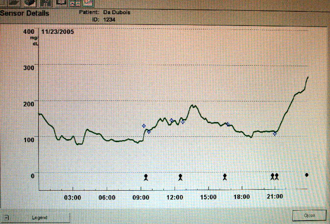
The first thing you might notice is the perspective has changed. The little graphs are square, and this one is a rectangle. That has the effect of exaggerating peaks and valleys on the smaller graphs. They really ought to be the same to keep our brains from melting. I guess I could re-size the screen shot manually into a square each time, but I shouldn't have to. A larger complaint is that there is no precise way of knowing what the readings are. In the modal day graph you can hover your mouse over any line and it will tell you the day and the BG at that point. That feature should exist on the day chart, and it doesn’t.
The little icons on the bottom show insulin and carbs. Again, no way to know how much. If you want to know how big a bolus you pumped into yourself at 12:30 on the 23rd it sure would be nice to click on that insulin icon, wouldn’t it? Forget about it. You need to go back to the log book and look it up.
Another thing I don’t like about this chart is the scale on the left. I’d rather we had some lines every 25 points instead of every 100. Makes it hard to know with any accuracy what your reading is. Most diabetes software programs let you enter a range, which is then shaded in blue, or green, or whatever, to show you where your number are generally supposed to be. Again, this kind of feature is missing.
This software is like having an old fashioned TV antenna, rather than Cable. Yeah, we got a picture, but that is about it. I do like having the data displayed as a graph, rather than a table--a weakness of the original Cozmo software. Being a visual person tables do nothing for me, but give me a graph and I can instantly understand what is going on.
Solutions is better than nothing, and it is really cool to see what your BG is doing at any point. It is just that it could be soooooo much better. I dearly hope that an upgrade is in the works (hint, hint, Medtronic).
posted by Wil | 5:33 PM
![]()
![]()
1 Comments:
I agree with Ellen, if Medtronic doesn't pay you they should at least give close attention to your evaluation. Yesterday, in fact, I forwarded a link to your blog to my local Minimed rep and his nurse assistant. I really appreciate your indepth evaluations!
Keith
Post a Comment
<< Home